Masala : A Design System for Kolkata Chai Co.
Building a design system to facilitate a consistent design experience for Kolkata Chai Co.
Client
Kolkata Chai Co.
Role
UX Designer
Team
3 UX Consultants
Contribution
UI Audit, Branding, Creating components, icons & spacing guidelines, Evaluating accessibility, Writing documentation, Presentation & Pitch
Duration
8 Weeks
Tools
Figma, Miro, Google Workspace, Zeroheight
BACKGROUND
Why does Kolkata Chai Co. need a design system?
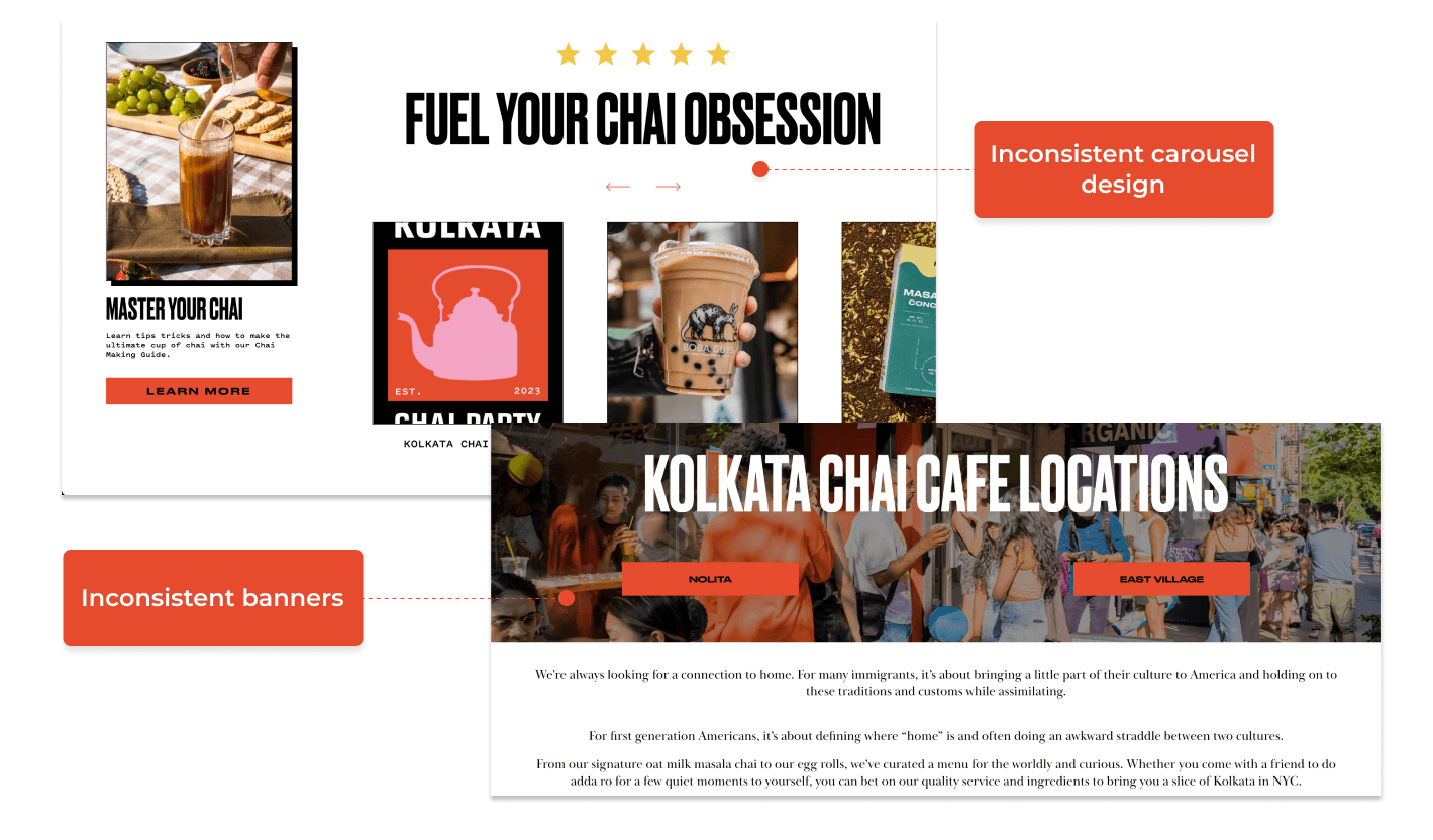
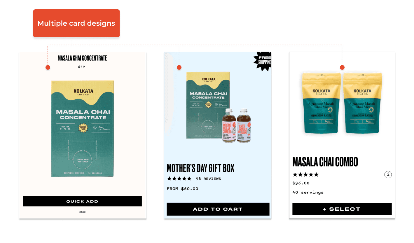
Inconsistencies
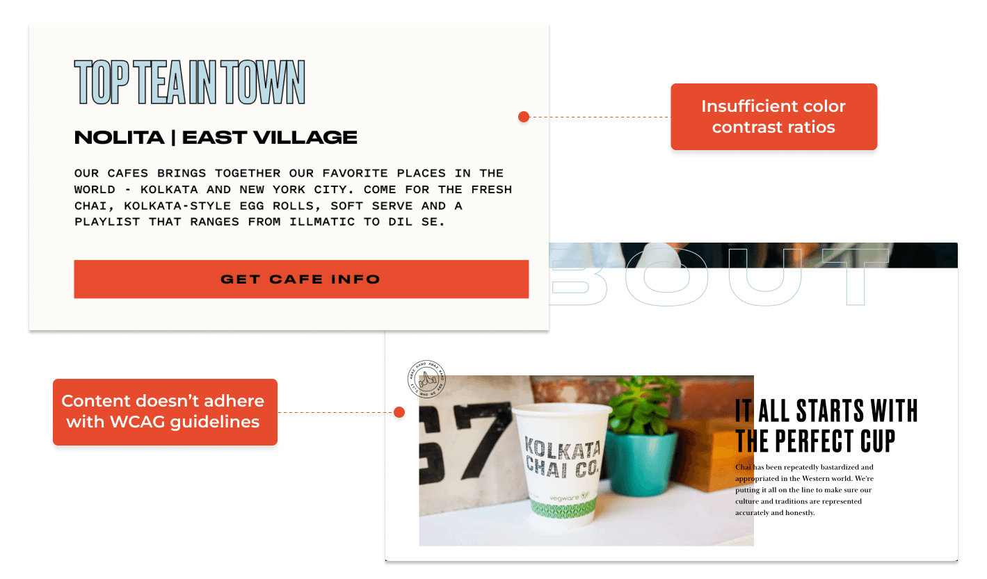
We found numerous inconsistencies in design across the website which can lead to poor user experience and confusion around brand identity, which can led to lack of trust amongst users.
Scalability
The scaling of a website becomes difficult without a design system. Without standardized components and styles, designing new elements and features becomes time consuming, inefficient and inconsistent.
Accessibility
PROCESS
How did we create the design system?
01 Conducting UI Audit
We broke down the existing Kolkata Chai Co. website to create a UI inventory, audited for a baseline of the current design ecosystem and then identified the patterns and inconsistencies in design.
02 Defining Brand Values
We explored the brand and voice of Kolkata Chai Co. by establishing design principles and values and developing a name for the design system.
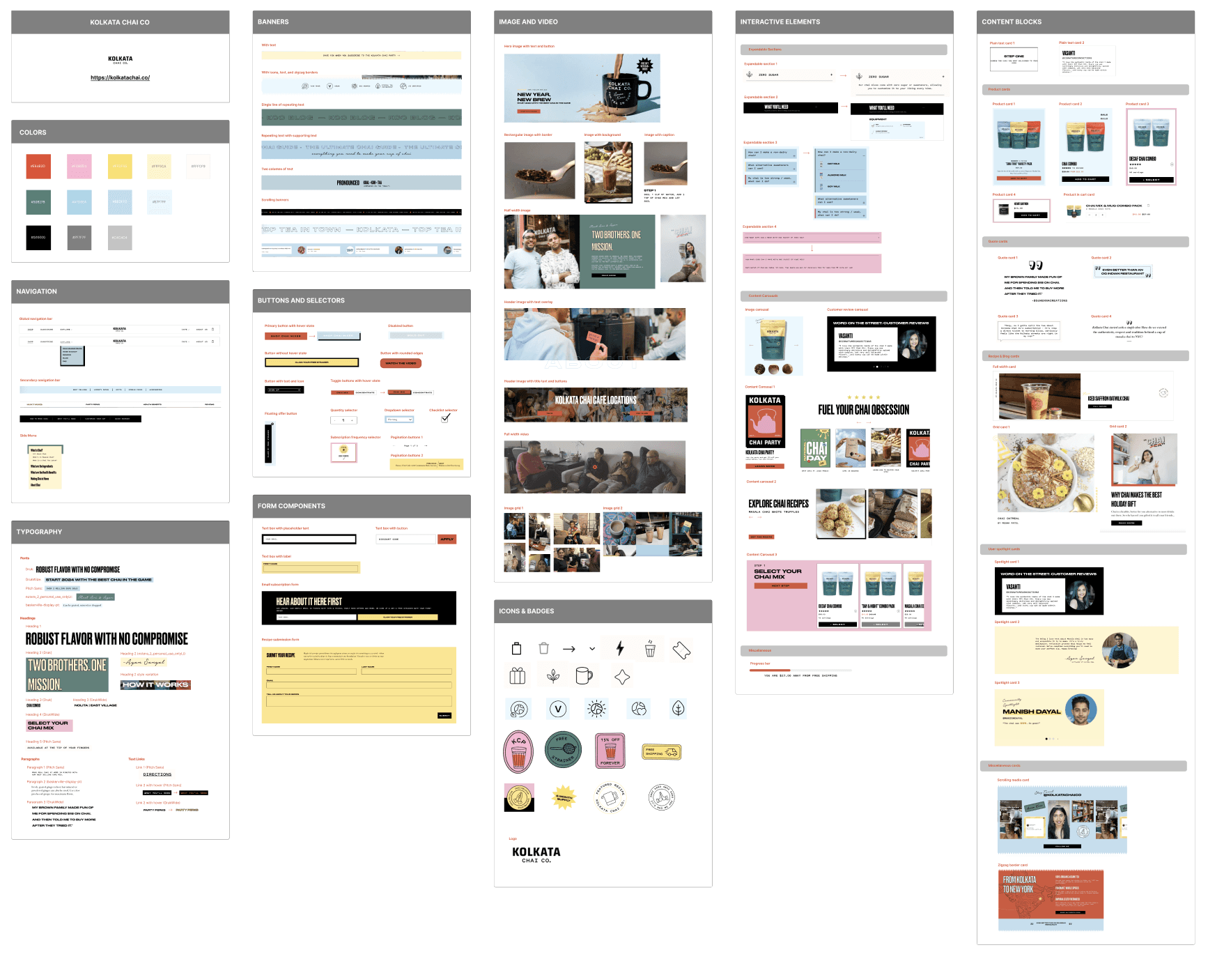
03 Creating Components
We created a library of UI foundations, components, and values in Figma based on the UI inventory. After publishing the UI kit, we tested it with users to ensure its effectiveness.
04 Documenting the system
We documented design guidelines, component usage, accessibility principles, governance policies, resources, and support materials.
UI AUDIT
We deconstructed the current website to create an interface inventory
DESIGN PRINCIPLES
Defining design principles to ensure that the design system stays true to the brand
We outlined three principles to represent the voice of Masala. We wanted the design system to be closely aligned with the brand values of Kolkata Chai Co.
The name ‘MASALA’ meaning spice, which encompasses the blend of different elements together that enhance chai - the functionality we hope that the design system embodies in being a systematic blend of all components that can be put together to bring the website alive.
Authentic
By incorporating elements such as vibrant colors and authentic imagery, it evokes nostalgia and creates an immersive experience for customers, allowing them to savor not just the flavor but also the culture of authentic Indian chai.
Bold
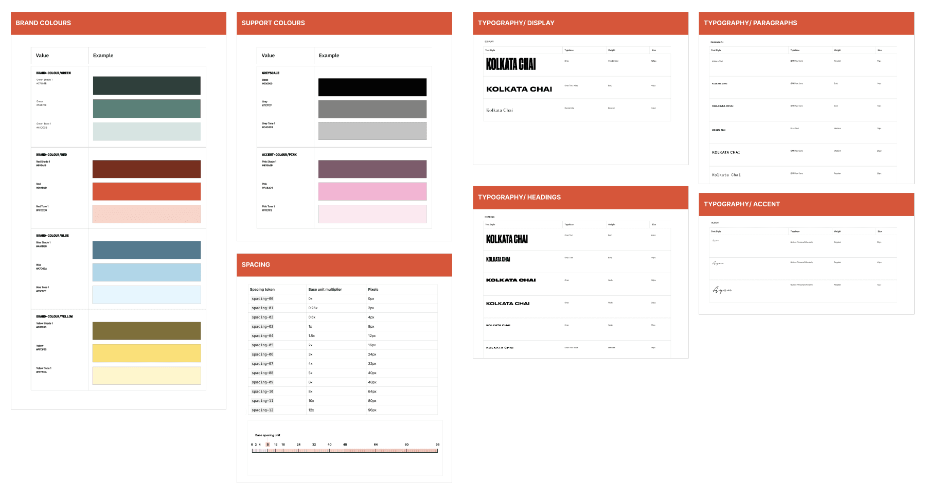
Through striking color schemes inspired by the hues of Indian spices and textiles, as well as dynamic typography, we can capture the vibrant essence of Indian culture.
Clear
We believe that a clear design system establishes standardized patterns, guidelines, and components, enabling designers and developers to work efficiently and maintain visual harmony throughout the product.
DESIGN FOUNDATIONS
We created foundational styles and tokens to start building the design system
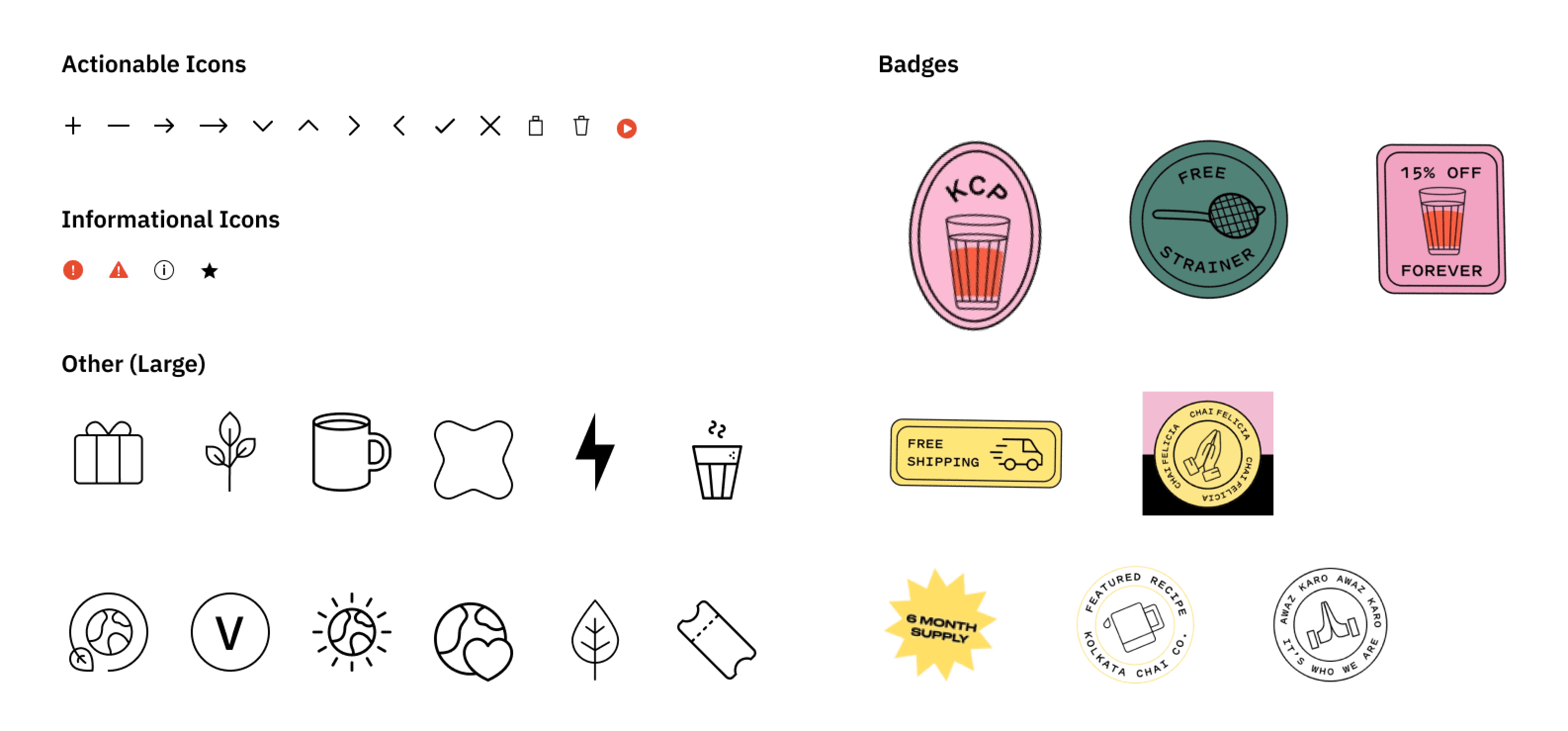
The icons were designed to be simple and informative. There are variations to suit different contexts. The default type is a black outline version, but filled icons can be utilized when needed. We incorporated badges that can be placed flexibly within different components and layouts to retain the distinctive playfulness of the brand.
COMPONENTS LIBRARY
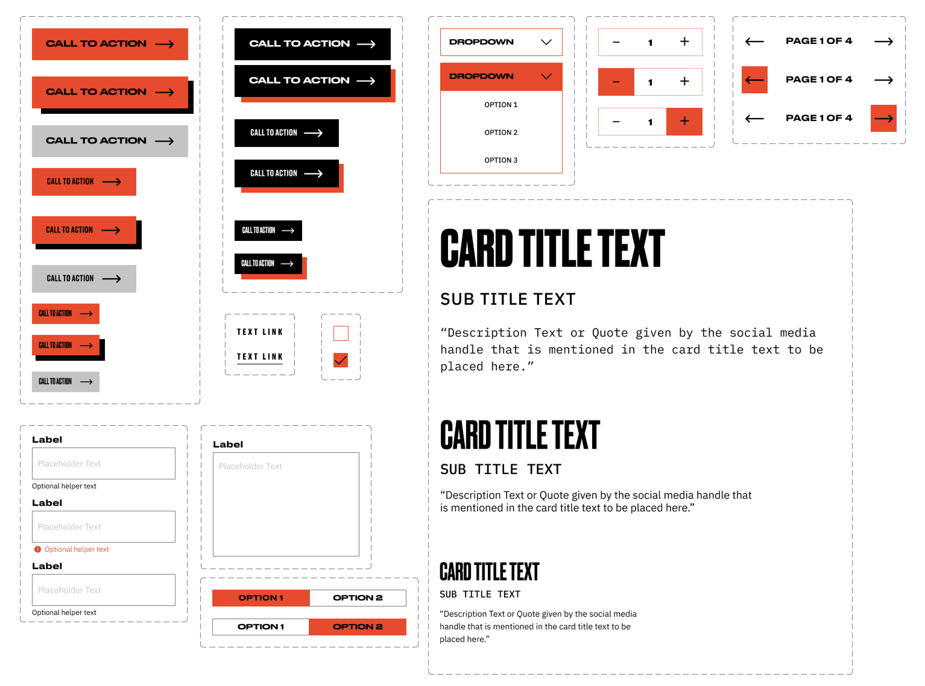
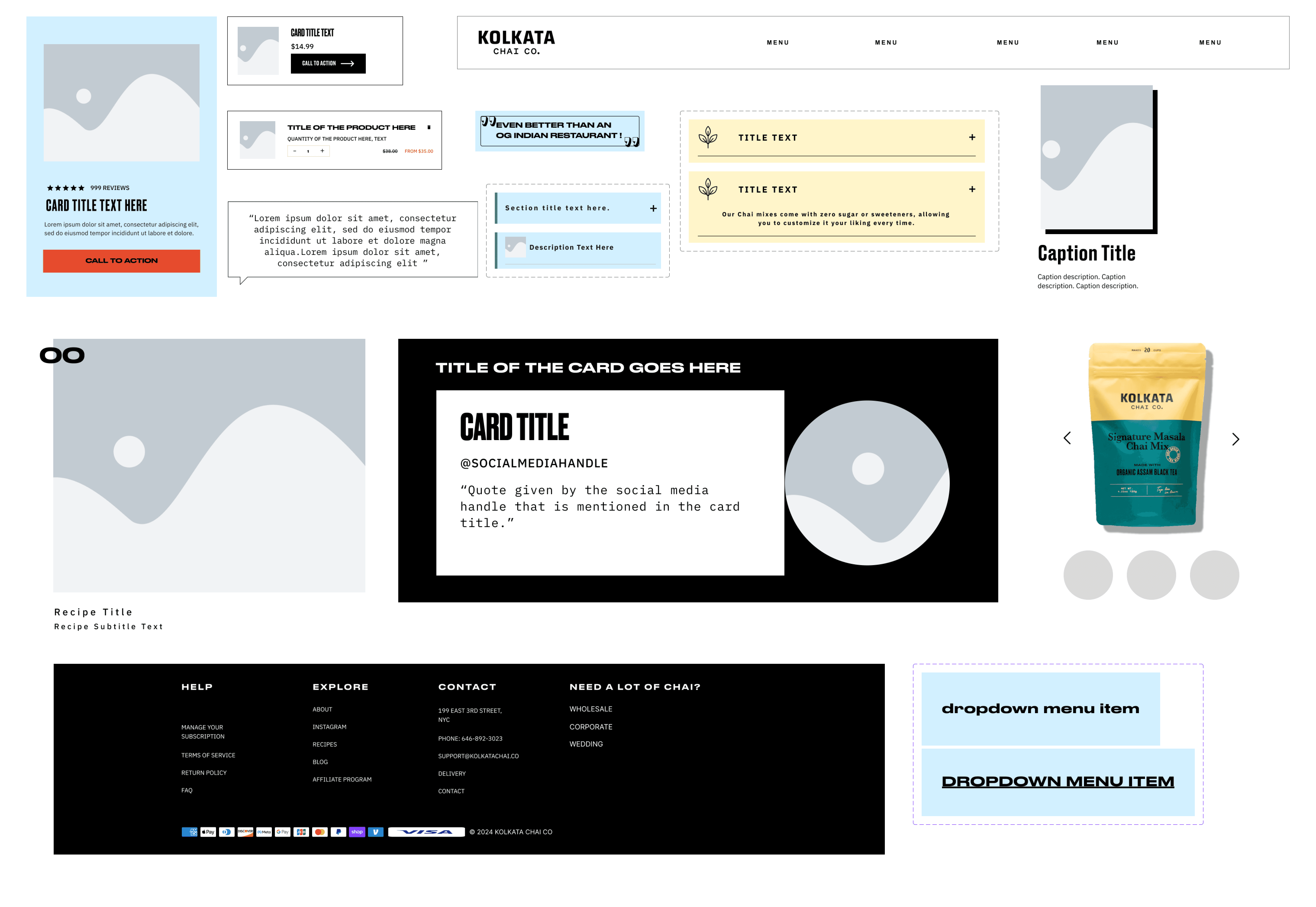
We created tailored components that are flexible and adaptable to different use cases
DOCUMENTATION
Writing documentation for Masala
We documented our system on Zeroheight to define the overall structure of our design system. It contains the design principles of the system, a comprehensive collection of foundation styles and components created, guidelines for usage of components, useful tools and resources, and governance information. This ensures that the design system is usable and understandable for the users.
PRESENTATION + PITCH
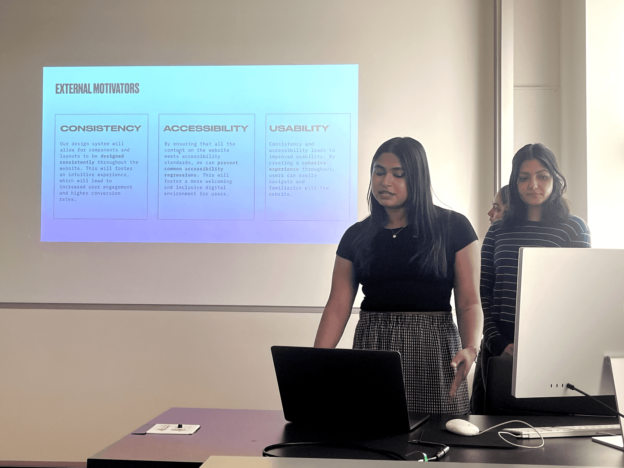
Pitching our design system
In our pitch, we emphasized on the features that makes Masala unique: bold colors, custom components, flexible layouts, accessibility and detailed guidelines about the system and its usage.
The pitch included a demo showcasing the ease of using Masala to create a new webpage, which was well received by the audience.
TAKEAWAYS
If we had more time…
I would like to work on creating more variants for the components. I would also like to take another go at naming of components and categories, to see if there is a better way to represent all the different cards, interactive elements we created.
User testing is essential for identifying potential issues in any product. For this project, we conducted a round of user testing and used participant feedback to refine our system. Testing proved invaluable in enhancing the product. With more time, I would love to conduct additional rounds of user testing to further improve the Masala design system!
What I learnt.
A design system brings together different components like UI elements, style guides, and UX standards to create a cohesive foundation for design consistency. Working on creating a design system from scratch, helped me develop a strong understanding of both component-level precision and system-wide coherence.
Building a design system can present challenges when it comes to deciding what to remove or combine. Evaluating each element using accessibility guidelines simplifies the process and ensures a more effective approach.

